Tuesday, 20 December 2011

My Love

Remember THIS layout? The one I made after being inspired by Finnabair (Anna Dąbrowska -Pękocka). She makes amazing grungy layouts and I have been trying to figure out how she does it. At first I thought she used gesso and so that's what I used. It turned out that I was wrong because the finished effect didn't look like what it's supposed to. But at least I found a new technique. 

Two days ago, I saw on Live With Prima on Ustream that Finnabair made a tutorial video of her special grungy technique. It was amazing to see all the little details in her work - the masking, the misting of 5 Glimmer Mist colours and the 4 different types of stamps she used just to make the background. After that came the embellishment arranged around the photo and so on and so forth. 

Of course I just HAD to try making a layout. I didn't have the same products that she used, nor did I used all Prima products. I just made do with whatever I have.

Here's my take..... drum roll......


I think I'm getting the how, although mine isn't too grungy except for the embellishment part. But the colours look a little too bright for a grungy look. Some close ups


28 - because he was born on the 28th. 

If you look closely, I masked with Tim Holtz gear mask, stamped the filigree-liked image
from Prima, script  from Fancy Pants Designs and messy spots from
 Tim Holtz Stampers Anonymous.

The clock dials and the gears I got from an old Swirlydoos kit, which I have
 been hoarding a ages. The street light is from Kaiser.


I am happy with the job I did. But next time I would use darker shades of the Glimnmer Mist colours.

Thanks for dropping by everyone. Have a nice day!!

Sunday, 18 December 2011

The Good Old Days

I had so much fun making a layout yesterday after a long break that I decided to make another one last night. I had been browsing Christine Middlecamp's blog last night and was inspired by her layering techniques. They was she just pile it up, you don't feel like everything is a mess. So armed with my Crate Paper goodies, I started layering and piling up. 

This id what I came up with:


Looks a little messy but not too bad, I think. The collection that I used is Restoration which I think goes with the old photo of me and my brothers taken some time in the 70s. If you noticed, the photo has a lot of white spots due to old age. This was actually scanned from the original photo and I decided not to do any touch ups to it just to add some uniqueness to the layout. In other words, I was just plain lazy.. hahahaa!!

Anyways, that's my attempt at layering. Needs more practice, that's for sure. Go check out Christine's work if you haven't already. She does some pretty amazing work.

Till the next time, thanks for stopping by!!

Saturday, 17 December 2011

Sue & Yatie

It seems like such a long time since I last scrapped and today when I decided to make a layout, I find myself weeding through my stash looking for the right paper and the right mist colour and other things. A simple layout that would usually take me an hour or two to finish ended up taking almost a whole day. Oh well, I guess it'll probably take me a few days to get my engine smooth sailing again.

Today's layout is a simple one with mostly paper and some cutting, misting, inking, stamping and rub ons. Here's what I came out with..

Using papers from Kaisercraft's Chanteuse line and one old paper from my scrap drawer, which I don't remember where it's from, I'm happy with the mixture of pink and green and cream which compliments the photo well.

The rub on quotes are from Kaisercraft and the one on the strip is from Bo Bunny Mama-razzi collection. The doileys were misted with Glimmer Mist Olive Vine and Apple Glitter, and inked with Rusty Hinge distress ink.

I originally stamped the little flowers on the grid paper and accidently stamped on the pink background paper, and thought what the heck... I might as well go all the way.. hahaaa.

The photo is of me and one of my oldest and bestest of friends, Sue. We've known each other for almost 30 years now, and I hope we'll stay friends for 30 more years!!!


Wednesday, 2 November 2011

My Lil' Lady

LAYERS.

That's one of the criteria for this month's challenge at Scrap-It-Lah. November brings you Debbi Tehrani as the Guest Designer. Visit her blog at Little Scrap Of Magic. Her work is beautiful with lots of details. Debbi has come out with three things that you need to have in your layout. They are:

1. Layers - at least 6
2. Stamping and/or embossing
3. Tags or journaling cards incorporated into your design
(not necessarily used to journal on but can be if you choose)

Please visit SIL blog for further details and for samples from the other DTs.

Here's my take:


Prima flowers, of course. The purple one was originally white which I had sprayed to match colours of the doilies and the little flowers on Nadiah's clothes. I don't know if you can see, but I have 7 layers here with 4 patterned papers, 2 doilies and 1 journaling card.


I stamped the butterflies with three different colours and hand cut them.


I love the rub on quotes framing the photo.


Photo of Nadiah in her traditional baju kurung on Eid day. This year was the first time that she did not mind wearing them. She looked just lovely and all grown up.

So come and join the challenge over at Scrap-It-Lah and you could be the winner of a yummy RAK!! All the best!!

Monday, 3 October 2011

Love Is Many Things

Yes, I know, I know.. I've been MIA for so long. It's been crazy these last few months with beadwork and Ramadhan and Eid, plus I was seriously missing scrapping juice. But today I am back with Scrap-It-Lah's October challenge. This month we have another Guest DT who hails from Sweden and has brought us a very interesting challenge. She is Eila Sandberg and her challenge is:

1. Old book paper, sheet music or something similar
downloaded off the internet & printed out.
2. Fussy-cutting.
3. Hand-stitching using embroidery floss.

Here is my take:


Fussy cutting: banners


Old dictionary paper


Sewing with embroidery floss

That red doily was an awesome find. We were cleaning out mom's old cabinet and I found beautiful red and blue doilies and some old lacey napkins that mom was ready to throw out. I of course came to the rescue and saved everything.. hahaa!!

The dictionary papers were so thin and very delicate. I had to be very very careful in coloring them. I just spritzed them with some Glimmer Mists and carefully dried them up.

So do drop by SIL blog and have a go at the current challenge and don't forget to ohh and ahh all the DT samples. Remember that challenge ends on the 31st October and do link up your layouts using Mr Linky at the bottom of the post over at SIL blog.

Happy creating!!

Wednesday, 17 August 2011

Puffed-Up Paper Stars Tutorial

Remember this layout with the star shaped balloons?

Do you want to know how to make those cute little stars?

<<>>

Ok, I've done a tutorial on that over at Altered Project Inc. Do hop on over to see how it's done.

Tuesday, 2 August 2011

Love Grows (Scrap-It-Lah)

Happy August, everyone!

First off, I wold like to say Salam Ramadhan to my Muslim friends out there and may you have a blessed one this year.

And now on to the challenge. This month Scrap-It-Lah is excited to bring you Iris Babao Uy as the Guest Designer. She is no stranger to the scrapping world and has been designing for Prima, Webster's Pages and Lily Bee Designs to name a few. The challenge that she has come out with is to have "three things in your layout... stamping, embossing, and misting. Plus there must be at least one raw chipboard to dress up". Oh what fun!! Just my kind of challenge. Please go HERE to see more details on the challenge and check out the Iris' layout and the other DTs' takes on it too.

Here is my take:


Inking, stamping and embossing on the chipboard letters.


Do hop over to SIL and play along with us. Ok, must go. See you again next time. Happy crafting!

Tuesday, 26 July 2011

Fly Like A Kite (Butterfly Crafts)

Ok, this is wayyyyy overdue. I have been crazy busy with beading that I have no time for anything else whatsoever. But I am taking this few minutes to update on Butterfly Crafts July challenge which went live on the 15th. The challenge is an ad inspiration challenge and here's the ad:


And here is my take:


My point of inspiration from the ad comes from the balloons. I recreated them by using these paper star balloons which I made. Aren't they cute? I used to make them when I was a little girl in school. I used to have jars of colourful stars and they were so cute and pretty.


So do hop over to Butterfly Crafts and join in the challenge. You'll have until mid August to create something and submit yours.

And on that note, I'm going to start on my beading again and I'll see you on the 1st. Buhbye!!

Saturday, 16 July 2011

Guest Designer at Scrappin Studio (Pt.2)

Good morning.

I'm back again with the 2nd part of my guest designer work reveal with Scrappin Studio. Without further ado, here's another layout and a mini album.

2nd Layout - Beautiful Perth

It's a simple layout with not much techniques except for the masking.


2nd altered project - Pocket Tag Mini Album


In one of the kits that I received, there was a set of beautiful vintage 7Gypsies tags. So I decided to make pockets from the papers in the kit to slot in the tags.


I used the pages on the right to put single words to describe Nadiah and the pages on the left are filled with beautiful quotes.

Love those buttons. they're so pretty!!

I loved making this mini album and let me tell you, it didn't take that much time to do too!

So do hop over to Scrappin Studio BLOG to see what the DTs has come up with the kits. There are truly an inspirational team. Thank you again to Jaime for the invite to be Scrappin Studio's guest designer. It's been an honour.

Friday, 15 July 2011

Guest Designer at Scrappin Studio (Pt.1)

Hello everyone.

As the title suggests, this month I have been invited by the lovely Jaime Lee to be the Guest Designer over at Scrappin Studio. You may know that SS carries the awesome kits by Studio Calico. I was asked to do 4 projects which consists of 2 layouts and 2 altered projects. Please go over HERE to see my work and from there you can just follow the links to the store and get your own kits.

Today I'll be posting two of my work for Scrappin Studio, with some close-ups.

1st layout - So Sweet


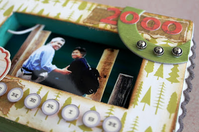
1st altered project - 2000, An Altered Canvas Back

The back of a canvas frame makes a great picture frame. The photo was taken more than 10 years ago and hubby and I was sitting at the edge of a boat pier, dangling our feet down. But instead of sticking the photo inside the frame, I stuck it on the ledge of the frame. It makes it look like we're about to jump into the canvas frame.


Do come back tomorrow for the details of my other two projects.

I gotta run now and will see you again soon. Ta-ta!!

LinkWithin

Related Posts with Thumbnails