Monday, 31 January 2011

Last Two Layouts for January

Hello hello!!

It's already the last day of January. How time flies. Before we know it, it'll be December and we're getting ready for another new year.

I am happy to have done quite a number of layouts for this month, compared to the last few months. Things have settled down a little that I've had some free time to scrap.... and I likey!!! :D
I managed to squeeze out two more layouts from the Studio Calico kits and the first is titled:

Just The 2 Of Us


Inspired by Iris Uy's layout for Scrappin Studio from THIS post, where she inked the resist Pink Paislee paper. It's so beautiful that I had to scraplift her technique.

Materials used: Patterned papers: Pink Paislee, Basic Grey. Alpha stickers: Sassafras Lass, Basic Grey. Circle frame: Pink Paislee. Swirly pearls: ZVA Creative. Flowers: Prima Marketing. Stickers: Basic Grey. Journaling card: My Mind's Eye. Others: Tim Holtz distress ink pads (Shabby Shutters, Barn Door, Worn Lipstick, Spun Sugar, Crushed Olive).


Cameron Highlands


I used 2 papers from the Who's Who kit and I absolutely adore October Afternoon's Campsite: Animal Tracks paper, which I've cut up to embellish around the photo. Then I added cardstock stickers from Sassafras Lass from my own collection to add to the embellishment. I love the 'cartoony' feel of them. Something different from what I usually do.

Materials used:
Patterned papers: Studio Calico, October Afternoon. Stickers: Sassafras Lass, October Afternoon. Cardstock borders: KI Memories. Others: Tim Holtz Distress Ink: Tumbled Glass.


Thanks for dropping by!!!

Sunday, 30 January 2011

Love U Lots

Hey everyone!!

Here's a recent layout I did based on the sketch I received for the Sketches 2 Scrapbook Winter release in my previous post, but I decided to turn the sketch around 90 degrees.


I used a lot of inking and misting for this. Mostly to get the colours coordinated with the photos that I've used. Like that pink patterned paper, which comes from My Mind's Eye's Union Station collection and originally has a cream background.

I simply love the roses from Prima!!


Lately I find myself creating layouts with LOVE themes. Really getting myself into the Valentine's mood.. :D.

Materials used:
Patterned papers: Heidi Swapp, My Minds' Eye, October Afternoon. Flowers n swirly crystals: Prima Markating. Cardstock stickers: Bazzill Basics. Journaling card: Pink Paislee. Alpha stickers: Creative Imaginations. Others: Tim Holtz Distress inks, Tattered Angels Glimmer Mists and Japanese paper lace.


Saturday, 29 January 2011

Sketches 2 Scrapbook Winter Release

Hi hi everybody!!

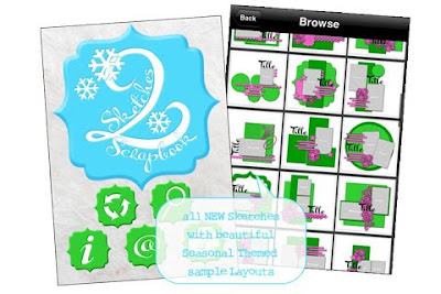
I am very happy to announce that Sketches 2 Scrapbook has launched it's Winter Release yesterday at the iTunes store for US$ 3.99. Like the original release, it's only compatible with iPhone, iPod and iPad, but the version for other smartphones are coming soon. So please be patient!!

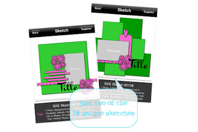
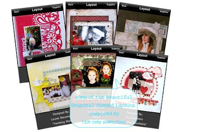
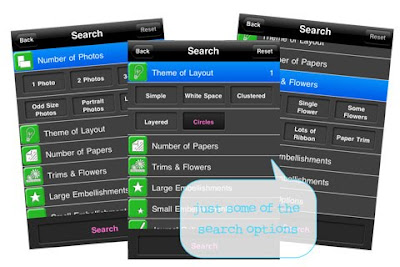
Here are some pictures which I took from the iTunes store


You can also try the Lite version which is FREE and it gives you 25 samples of sketches and layouts.

I would like to thank Anam Stubbington for inviting me to take part in this cool venture again. I've done 1 layout this time and simple love the sketch. Here's my layout, which we are allowed to share. You can see my layout in the app on Sketch#0130


So if you've got an iPhone, iPod or iPad, go grab this app quick. And in celebration of this bew release, the originall release is on sale for only US$ 2.99!!

Reading

Hi everyone!!

Here's another layout I made using Scrappin Studio's Studio Calico kit Who's Who.


The Office Pockets from KI Memories... LOVE IT!!! It's so cute. Love those Basic Grey's Curio Decorative Stickers too!!

I'm not the best at doodling, but I love the effect. I always try to limit my doodling to the minimum.

Oh, love that books stamp from Studio Calico too!!

Sunday, 16 January 2011

Swim Like A Fish

Just recently a new kit club was launched in Malaysia and it's called Scrappin Studio. What I like most about it is that they carry Studio Calico kits - main and add-0ns. I was so excited that I straightaway ordered some and didn't waste anytime creating a layout or two.

I was browsing the Scrappin Studio blog this morning and noticed that they are having a challenge hosted by DT Amelia, to create a layout with flowers in it.

One of the layouts I did recently has flowers in it; albeit paper ones so I hope paper flowers counts :D. So here's my take:


I love these Sassafras Lass cardstock flowers that came in the kit. The hearts and the girl are stamped with clear acrylic stamps. Both came in the add-on kit, Mary Jane.


Most of the items used came from the kits except for those chipboard alphas that spell S-W-I-M, the chipboard stickers and the journaling card.


I used items from the main kit, Who's Who and add-on kit, Mary Jane. I seldom create layouts which are bright and cheerie. Most times I'm a flower and vintage and distressed kinda a scrapper. But this was fun and I love those border sticker sheets that we got in the kit. Loving the sunny feeling of the whole layout.

Materials used:
Patterned papers: Pink Paislee, October Afternoon. Alphabet stickers: Basic Grey. Chipboard alphas: Making Memories. Chipboard stickers: RAK from Michelle. Clear acrylic stamps: Studio Calico. Inks: Tsukineko, TH Distress ink. Pearls: Pebbles. Sticker borders: KI Memories. Lace trim: My Mind's Eye. Journaling card: Jillibean Soup.

Wednesday, 12 January 2011

Flower Girl

I was so happy with myself with the layout I did this morning after watching Cari Fennell's tutorial on Prima ustream, that I decided to find another tutorial and make another flower-power layout. And I found one, which is a Pocket Layout by Marion Smith and it has lots of flowers. I didn't have the kit that she was using but make do with whatever I had in my stash.

It's a pocket layout which means that the bottom bit with the light green paper makes the pocket where you can slide in your photos and if you go see the layout that Marion made, you'll see that she has made it so beautifully covered with flowers that it looks like a garden. It's just awesome!!


Here's a little closer look at the flowers. I actually added a journaling card made from Prima packaging, which was not in the tutorial but I love to journal so I added that in.


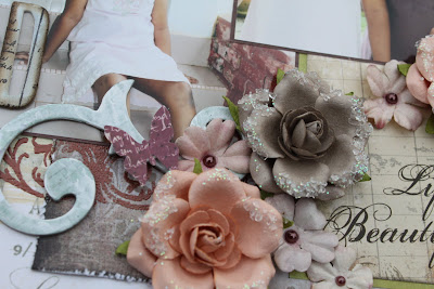
A cluster of flower with a butterfly on the left top corner of the photo. And if you look closely, that doily comes from a Prima packaging too. Isn't it great that we can recycle?


I slid out the photos so you can see what it looks like without them. It's great that I just have these photos of Nadiah examining some flowers, which sort of goes with the flowery theme I've got going here :D.


Zoom in at the centerpiece. You can see another doily layered down which I've sprayed with Glimmer Mist Deep Purple and Starfish.


Materials used:
Patterned papers: Creative Imaginations, 7Gypsies. Flowers: Prima Marketing, RAK from Aida (small white & pink roses). Butterflies, swirly pearls & journaling card: Prima Marketing. Doilies: Prima Marketing, various. Alphas: American Crafts, Making Memories. Others: Tim Holtz Distress Ink, Tattered Angels Glimmer Mist


Beautiful Cousins

This morning I didn't exactly plan to scrap but I was browsing through Facebook and I saw that Prima had a live tutorial on ustream and it had just started. So I hopped over and started watching Cari Fennell doing a tutorial on a very pretty flowery layout. I found myself mentally flipping through my paper stash and thinking which flowers to use and before long I was at my scrapping table and an hour later I'd finished a layout. A flowery one too.. :D


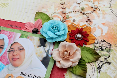
I just love lots and lots of flowers. Don't you? I try to mix up a bunch of different types of flowers so that it gives you that dimension that I so like.

Love that masking and misting too. Haven't done that in a while. I used Tattered Angels Glimmer Screens. The birdcage is a rub on. And don't you just love that swirly pearls with the cute little roses?

The alphas for the title are from Creative Imaginations Bare Elements which came in white but I inked them with Tim Holtz distress ink in Rusty Hinge.

Photo is of me and my cousin (obviously), Shirin, taken at her brother's engagement do in June last year.

I really love the finished look of this layout - the colourful flowers, the masking and just how the photo seems to pop up from the layout. So try browsing the many, many videos that Prima has put up on ustream, if you haven't already, and get some great ideas from the tutorials.

Materials used:
Papers: Prima Marketing, Chatterbox. Flowers, leaves & swirly pearls: Prima Marketing. Brads: My Mind's Eye. Rub ons: 7Gypsies, October Afternoon. Journaling card: Collage Press. Mask & mists: Tattered Angels.


Monday, 10 January 2011

Beads And Sequins

Do you know that January is the month of hobby? Just imagine how important is it to have a hobby that people actually dedicate a whole month to it. Most people don't just have one hobby but several, including myself. So this month at Scrap-It-Lah, we are celebrating hobbies, ones that are other than scrapping. But there's a twist to the challenge. You not only have to create a layout about our other hobby, but you must include some element of that hobby in your layout. For example, if you like shopping you can include the tags from your purchases or if you like reading, then you can add book pages to the layout. Cool huh?

You can read more about the challenge details and look at the awesome examples from the DTs HERE.

Anyway, here is my take on the challenge where I scrapped about beading embroidery. I actually embroidered beads and sequins and pearls on the layout.

I used Prima's stitched paper for this layout which is thin enough that it is easier to stitch on.


I tried to used as many fabric or lace for this layout to keep with my 'sewing' theme. That red velvet is not velvet paper but actual velvet materials that I've got lying around.

Do hop over to SIL blog and take part in the challenge. You'll be in the running to win a very yummy RAK from me.

Materials used:
Patterned paper: Prima Marketing. Alpha stickers: Webster's Pages. Journaling card: Fancy Pants Designs. Others: ribbon and lace, velvet material, beads, sequins, pearls and blings, Tim Holtz distress ink, Tattered Angels Glimmer Mist.


Before I end though, I would just like to say a very warm welcome to SIL new DT member, Sharmandeswari, who has join the line up of talented DTs. Welcome aboard, Sharm and hope that you'll have a splendid time creating with Scrap-It-Lah!!!

Teascape.... and other layouts

First of all... a very Happy New Year to everyone!!! I'm only 10 days late but I figured we're all still in the new year mood :D.

Admittedly I have been seriously neglecting my scrapping table for the past few months and only managed to do various layouts for DT assignments. It had been such a busy end of year for me that I just didn't feel like scrapping for a while. That means I did not managed to reach the 100 layouts target for 2010. Oh well.. I can always try again another year.. but not this year though. I'm giving this year a rest.

Ok, on to my layout which I did manage to do in December, using everything from Bo Bunny's Mamma-razzi collection.


Photo was taken at the Boh tea plantation in Cameron Highlands. I love the scenery at the plantation. It felt like another world for me, it was so breathtaking . I especially love the run ons from the collection. I used that and cut outs from one of the patterned papers to frame the photo and adding some dimension to it by popping up the cut outs.

On another note, remember the layouts I did for Sketches 2 Scrapbook? I've just been informed by Anam Stubbington that we are allowed to share the full layout on our blog. Both were of course, made with sketches from the Sketches2Scrapbook iPhone App So here's the first one, titled By The Beach


I inked the originally pink Making Memories alphas that spelled out 'beach' with Orange Marmalade distress ink and added some Vintage Photo distress stickles to give that sandy texture.


Materials used:
Patterned papers: Basic Grey (blue), Glitz Designs (brown). Chipboard alphas: Making Memories. Chipboard elements: Creative Imaginations. Journal cards & stickers: Making Memories. Flowers: Prima Marketing. Ribbons and pearl: Prima Marketing. Sticker alphas: Delish Designs. Others: Tim Holtz Distress Ink pads (Vintage Photo, Spiced Marmalade), Tattered Angels Glimmer Mist (Peach Delight, Starfish, Sea Glass, Tim Holtz Distress Stickles (Vintage Photo) and cork sheet.


The second layout I did for S2S is titled "In My Heart"


Materials used:
Patterned papers: Creative Imaginations (blue), Prima (pink), Basic Grey (white),.Journal sticker: Creative Imaginations. Glitter foam alphas: Creative Imaginations. Brads: Creative Imaginations. Flowers: Prima Marketing. Journal card: Pink Paislee. Others: Tim Holtz Distress Ink pad (Vintage Photo). Tattered Angels Glimmer Mist (Key Lime Pie)

LinkWithin

Related Posts with Thumbnails